


Gear For Good Life
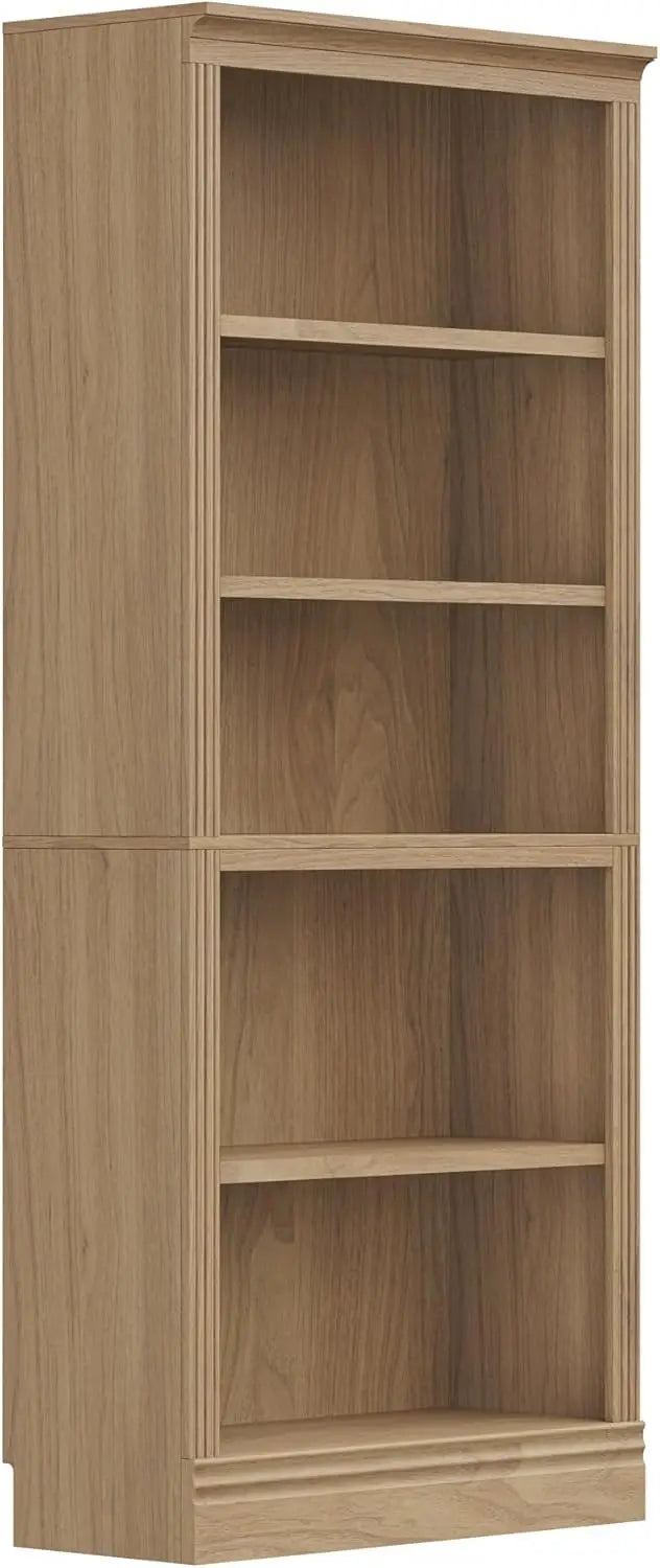
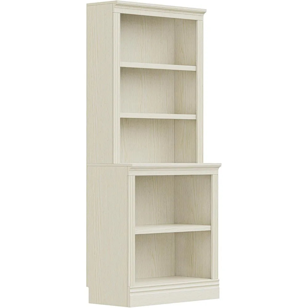
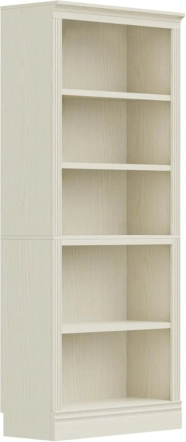
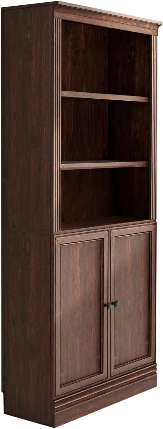
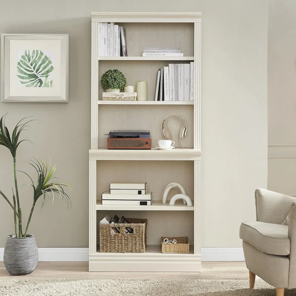
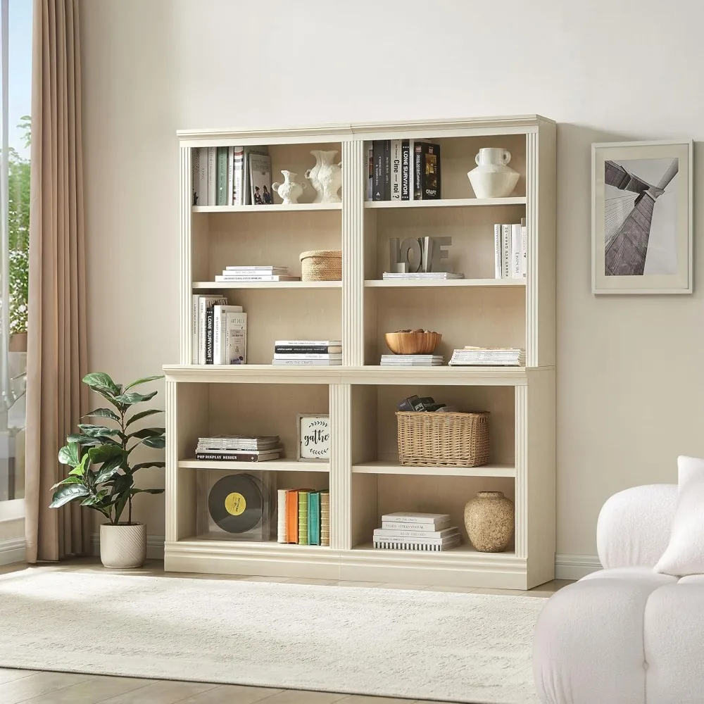
Halston Multi-Depth Bookcase - Adjustable Open Shelf Storage Unit for Home & Office, 31.5”L x 15.75”W Display Shelving
Halston Multi-Depth Bookcase - Adjustable Open Shelf Storage Unit for Home & Office, 31.5”L x 15.75”W Display Shelving
Couldn't load pickup availability
SPECIFICATIONS
Age Range (Description): Adult
Appearance: Modern Style
Brand Name: HUANZHUANG
General Use: Home Furniture
Hign-concerned Chemical: None
Installation Method: Assembly
Material: Engineered Wood
Mounting Type: Floor Mount
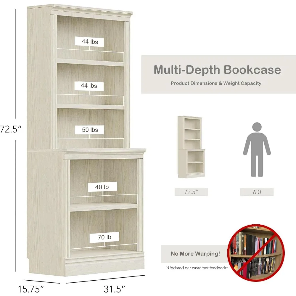
Number of Shelves: 5
Origin: US(Origin)
Place Of Origin: us
Product Care Instructions: Wipe with Dry Cloth
Room Type: Living Room, Bedroom, Dining Room, Family Room, Office, Library
Shape: Rectangular
Shelf Type: Engineered Wood
Size: 15.75"D x 31.5"W x 72.5"H,Multi-Depth
Special Feature: Modular Bookcase System
Specific Use: Bookcase
Style: Transitional
Type: Living Room Furniture
About this item
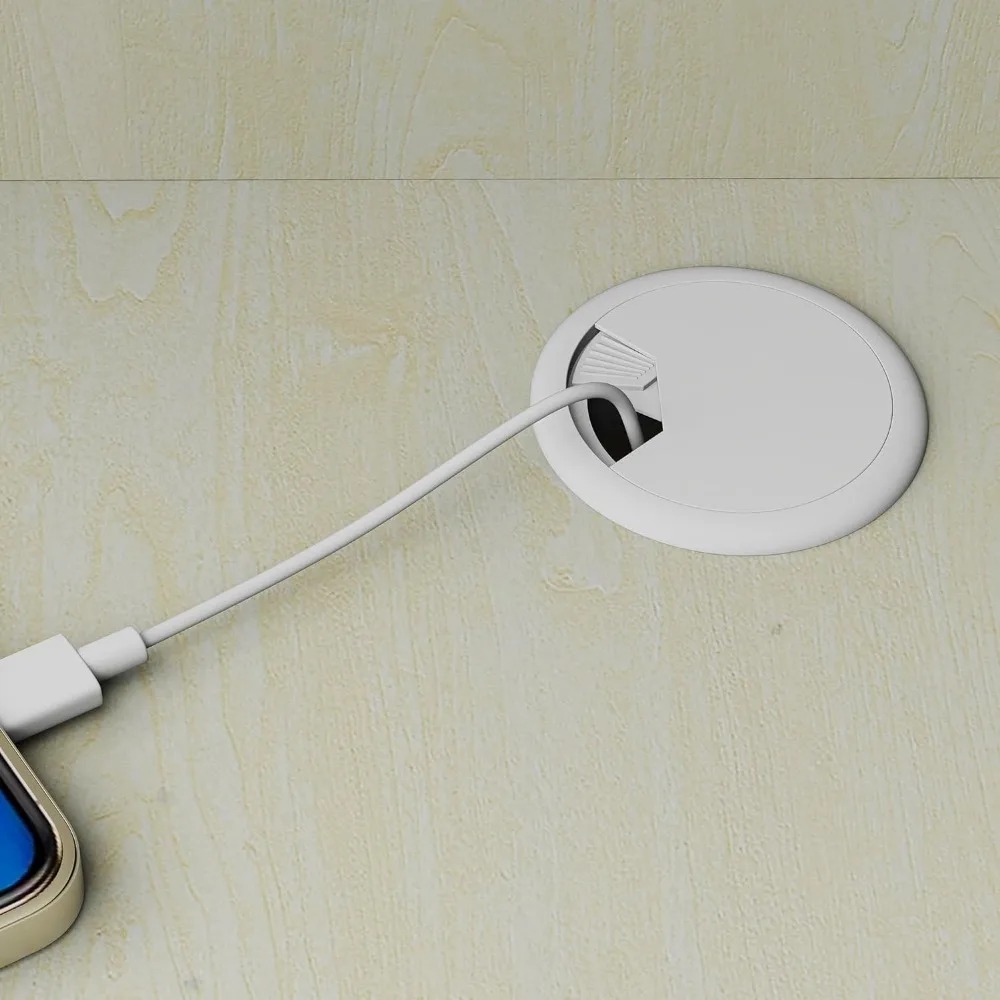
Customizable Storage Solutions: Adjustable shelves fit binders, photo albums, and decor, while the pre-drilled back panel creates a clean, seamless setup
Perfect Wall Fit & Stability: Features a 3.9-inch baseboard clearance, ensuring a perfect and flush fit against the wall, enhanced by the included adjustable leveling feet for alignment on uneven surfaces
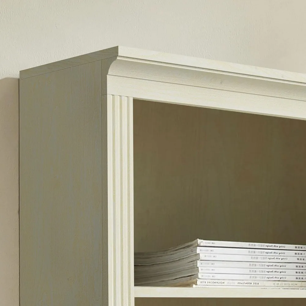
Versatile, Stylish Design: Storage unit easily adapts to your needs, whether you're showcasing favorite books, displaying decor, or organizing everyday essentials
Open Shelving Unit: The open design allows for flexible arrangements and quick access, making it ideal for any office, bedroom, or living space to elevate your home
Seamless Modular Integration: Our modular bookcase system is designed to seamlessly integrate with any of our narrow, standard, or multi-depth bookcase units, for complete customization of your living space


width: 100%;
height: 100%;
background-repeat: no-repeat;
background-size: cover;
}.aplus-v2 .aplus-review-right-padding {
padding-right: 0.1rem;
}.aplus-v2 .aplus-review-right-padding {
padding-right: 0.1rem;
}.aplus-v2 .aplus-review-right-padding {
padding-right: 0.1rem;
}.aplus-v2 .aplus-review-right-padding {
padding-right: 0.1rem;
}.aplus-v2 .container-with-background-image {
width: 100%;
height: 100%;
background-repeat: no-repeat;
background-size: cover;
}.aplus-v2 .apm-brand-story-carousel-container {
position: relative;
}
.aplus-v2 .apm-brand-story-carousel-hero-container,
.aplus-v2 .apm-brand-story-carousel-hero-container > div {
position: absolute;
width: 100%;
}/*
Ensuring the carousel takes only the space it needs.
The sizes need to be set again on the absolutely positioned elements so they can take up space.
*/
.aplus-v2 .apm-brand-story-carousel-container,
.aplus-v2 .apm-brand-story-carousel-hero-container {
height: 625px;
width: 100%;
max-width: 1464px;
margin-left: auto;
margin-right: auto;
overflow: hidden;
}
.aplus-v2 .apm-brand-story-carousel-hero-container,
.aplus-v2 .apm-brand-story-carousel-hero-container > div {
height: 625px;
}.aplus-v2 .apm-brand-story-carousel.a-carousel-container {
padding: 0px;
}
/*
This centers the carousel vertically on top of the hero image container and after the logo area (125px).
Margin-top = (heroHeight - cardHeight - logoAreaHeight) / 2 + logoAreaHeight
*/
.aplus-v2 .apm-brand-story-carousel .a-carousel-row-inner {
margin-top: 149px;
}
/*
Cards need to have a width set, otherwise they default to 50px or so.
All cards must have the same width. The carousel will resize itself so all cards take the width of the largest card.
The left margin is for leaving a space between each card.
*/
.aplus-v2 .apm-brand-story-carousel .a-carousel-card {
width: 362px;
margin-left: 30px !important;
}
/* styling the navigation buttons so they are taller, flush with the sides, and have a clean white background */
.aplus-v2 .apm-brand-story-carousel .a-carousel-col.a-carousel-left,
.aplus-v2 .apm-brand-story-carousel .a-carousel-col.a-carousel-right {
padding: 0px;
}
.aplus-v2 .apm-brand-story-carousel .a-carousel-col.a-carousel-left .a-button-image,
.aplus-v2 .apm-brand-story-carousel .a-carousel-col.a-carousel-right .a-button-image {
border: none;
margin: 0px;
}
.aplus-v2 .apm-brand-story-carousel .a-carousel-col.a-carousel-left .a-button-image .a-button-inner,
.aplus-v2 .apm-brand-story-carousel .a-carousel-col.a-carousel-right .a-button-image .a-button-inner {
background: #fff;
padding: 20px 6px;
}
.aplus-v2 .apm-brand-story-carousel .a-carousel-col.a-carousel-left .a-button-image .a-button-inner {
border-radius: 0px 4px 4px 0px;
}
.aplus-v2 .apm-brand-story-carousel .a-carousel-col.a-carousel-right .a-button-image .a-button-inner {
border-radius: 4px 0px 0px 4px;
}